
After spending some weeks playing with Penpot, I’ve taken many notes on features I’ve found useful, some I miss, and some I just find interesting. But if I have to choose a single thing to start writing about (after my first approach), it’s their flagship feature: the Penpot tokens and themes system.
In this post, I share some brief definitions and a case study on how to manage WordPress block theme design.
So, let’s get started!
What are “tokens”?
These are some definitions I found out there:
Design tokens are indivisible pieces of a design system such as colors, spacing, typography scale.
Design tokens are an essential building block of modern user interface design and engineering.
— Integrating Design And Code With Native Design Tokens In Penpot
Design tokens [provide] a single source of truth that both designers and developers could rely on.
[…] design tokens help us keep design consistent throughout different websites or products or whatever you’re designing.
But if I have to put it in my own words, I’d define tokens as the smallest part of a design system. They are basically used to define values (like colors, spacing, or typography), apply those to more complex and recurring elements, and offer the possibility of modifying them all at once. This way, you don’t have to edit elements one by one, which prevents mistakes and inconsistencies from slipping through. So, as I see it, token-based design system makes it way easier to create and maintain scalable, adaptable designs.
This might be the biggest difference from Figma: Penpot is the first design tool to incorporate native design tokens, following the W3C standard.
If you want to know more about what design tokens are and how Penpot got here, check this out:
How token system works on Penpot?
You’ll find in Penpot’s token panel a few types already defined, each with specific options. The values are automatically applied to the correct attributes when you select a compatible element and activate a token. I find this system way more practical than Figma’s variables, where you define individual values and have to manually select them from the attribute menus every time.
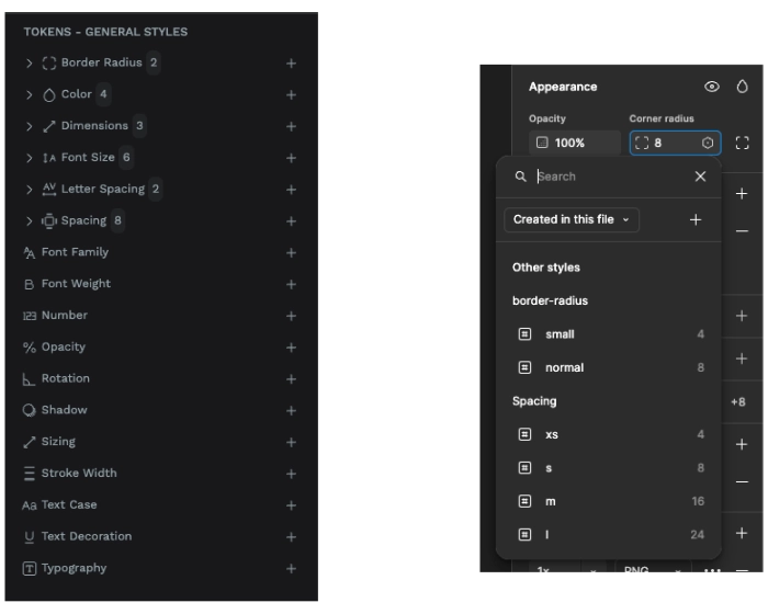
This hands-on video helped me to understand how this works:
The huge thing here is that you are not limited to numbers when defining token values. You can also use the property keywords or reference other tokens—”alias tokens”—. You can even create complex values by combining numbers, arithmetic operations and aliases. Laura Kalbag shows an example of this in this video (linked to the exact minute for your convenience, dear reader ❤️).
Sets and Themes
This was the trickiest part for me. After years of working with WordPress, the concept of “theme” has a specific shape in my mind. How it works, how it’s organized, and how it’s set up to function throughout a project is entirely shaped by WordPress’s logic and structure.
This isn’t necessarily a problem, but it did make it a bit harder for me to wrap my head around Penpot’s sets and themes. I also think this helps explain my take on this part of the tool.
Sets are groups of tokens that you assign to themes to determine which styles are enabled. From what I understand, the purpose of sets is to define themes.
If we take WordPress block themes as an example, each color palette or typography family would be a separated set. So you can create a [Penpot] theme for each combination.
Just in case it’s useful, I want to share Stuart Robson’s definitions, which I found really helpful:
[Sets] option gives you the ability to have defined layers (teirs) of your Design Tokens. So you can group related tokens into an easy ‘turn off and on-able’ set. You can also group token sets into a visual ‘folder’ in the UI.
Themes allow you to group your token sets for a specific context, like a unique brand or theme. Again you can also group your themes like you can with token sets. You can also apply the same token sets to multiple themes – which would be great for a multi-brand system that has similar base layer tokens.
I recommend Laura Kalbag’s Design tokens starter kit to play around and get familiar with. FYI, she explains it in great detail this this Penpot Hands-On video.
Case Study: How I use Penpot’s token system to design a commercial WordPress Block Theme
Designing WordPress block themes might be a pretty niche topic, but I think it might be useful to anyone who wants to understand Penpot’s token and theme system.
Know your tokens
How do I know which tokens I have to create?
First, my development team and I agreed on which tokens, styles, and settings we needed to define to make the [WordPress] theme look and function properly. There’s no standard yet for WordPress block themes, so we had to agree on a system—and we refine it with every new theme we create.
On top of that, after doing this a few times, I now know which values I’ll likely need to adjust or test as I design the pages and elements.
So, as many things in life, I know what to do through 1) talking to people, and 2) practicing. No shortcuts or one-size-fits-all solutions here.
Determine a system for your sets
Remember that the word “theme” has a different meaning in WordPress and Penpot. Since this post focuses on Penpot—not WordPress—I’ll use its terminology. So from now on, when I say “themes,” I’m referring to Penpot’s—which I use to define WordPress styles inside a WordPress block theme—unless I specify otherwise.
Themes are made up of sets, so you need to know what varies from one theme to another, and organize those differences into different sets that you can toggle on and off.
In my workflow, I created two types of tokens: the ones applied to every theme —though I might need to tweak them later for technical or content-related reasons—, and those specific to each theme.
Our Amaranto WordPress Block Theme has four different styles: the main one, a dark mode, and two additional variations. So the most logical approach for me was to create four themes.
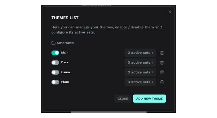
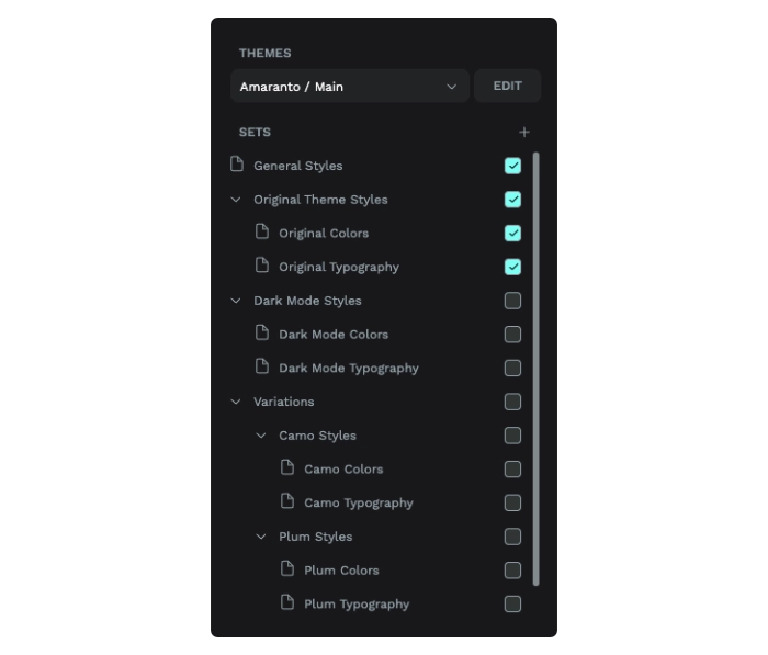
Following the WordPress Editor logic, I split the tokens into two sets: one for colors and one for typography.
The remaining tokens are grouped into one set I called “General Styles,” which includes the design elements consistent across all styles but that make Amaranto unique compared to other WordPress block themes I might design.
What about the theme lists?
Well, to be honest, it’s something I haven’t had to use yet. And I don’t think I’ll need it either. But going on with the example of creating commercial block themes for WordPress, I can think of a possible use for it.
When I choose a topic for a WordPress theme, I don’t only create color and typography combinations. I also create fake content that emulates the real needs for this topic. For example, a wine export company won’t need the same kind of content as a neighborhood association. So, even though it’s fake content, the elements and composition are completely different.
But let’s imagine that I don’t do it that way.
Another approach could be to create a set of patterns, templates, and pages that are the same for all WordPress themes. Then, instead of creating a separate Penpot file or project for each WordPress theme, I’d have just one and use the theme list system.
In this case, I’d create a different group for each WordPress theme (i.e., one for the wine export company, one for the neighborhood association, and so on). Inside of each Penpot’s theme group I’d put the different themes that correspond to each WordPress styles.
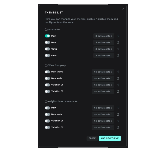
This is just one use case that comes to mind as a solo designer. I’m sure complex projects carried out by large teams have many uses for this system. I’d like to hear about real-world examples so let me know in the comments if you have one.
Penpot ♥ WordPress
I’m pretty sure that this system wasn’t created with WordPress in mind. However, even though it took me a while to create a workflow that actually worked for me, it fits really well.
In Figma, I basically defined collections and groups of variables, and applied them to different boards. This approach means I have to create a board for each style, page, template, or pattern.
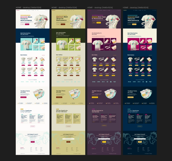
With Penpot, I only have to create one board for each piece of content, and I can organize the design elements according to the WordPress theme style they belong to.
Next steps (for you)
Are you new to all this mess?
I encourage you to check out all the resources I’ve linked in this post, and to ask here or in the Penpot Community if you have any questions.
Are you a veteran in design tokens?
You’re more than welcome to share your thoughts on how to better use Penpot’s Tokens, Sets, and Themes! I’m always wondering if there’s a better way to build my design system—whether to improve my work or to make collaboration with devs smoother. So it’d be great if you shared your suggestions, solutions, or posts in the comments!
Not sure who you are, but want more resources to keep exploring?
While researching for this post, I found Stuart Robson, who talks a lot about Design Tokens and other useful concepts (like Typography Scales, Components, and, of course, Penpot) on his blog. If you want to dive into the rabbit hole of improving your token-based design system, I recommend checking it out. You can also follow his Design System News.
Finally, I highly recommend exploring Penpot’s Hand-on Demos, hosted (mostly) by Laura Kalbag. I’d like to highlight her work on explaining Penpot as it has been essential for me in learning how to use it. Thank you, Laura! ❤️
Nexts steps (for me)
Well, I’ll keep sharing my journey from Figma to Penpot through WordPress block theme design here in my blog. There’s still plenty to explore and write about. Stay tuned!
Leave a Reply